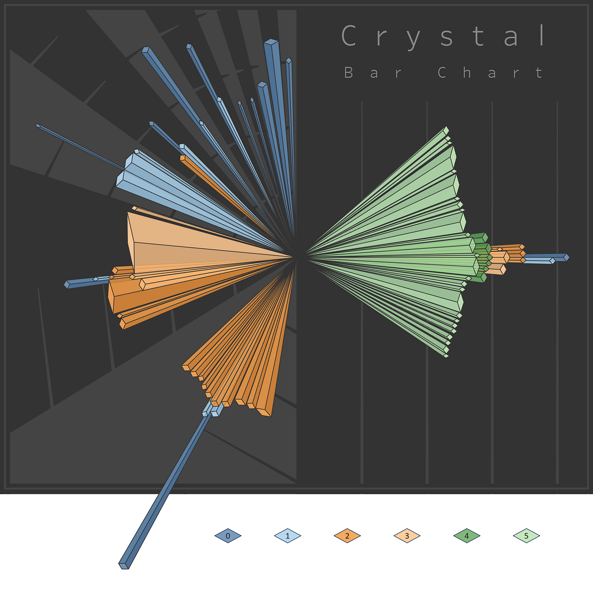
There are many ways to better understand a series of data. Whether it be a set of temperatures, test scores, grocery prices, step counts or UFO sightings, there’s always something to learn about the nature of something through the lens of data analysis and visualization.
In the following, I’ll describe a new technique for visualizing a series of data that uses simple threshold-based clustering. I hope you’ll find it to be a fresh approach to pair with conventional methods of visualization like histograms and box plots for gathering a new perspective on a feature of interest.
Numerically
How does one set itself apart? In terms of a single numerical attribute, let’s assume a simple threshold is the standard by which ordered values are compared to one another and separated into groups. Take for example the following sequence:
[ 0 , 1 , 1 , 2 , 3 , 5 , 8 , 13 , 21 , 34 , 55 , 89 , 144 ]
This is of course the first 13 digits of the Fibonacci sequence. If we take the difference of each value and the prior value in the sequence, starting with 3rd position, we get the same sequence shifted forward by 2 steps:
[ _ , _ , 0 , 1 , 1 , 2 , 3 , 5 , 8 , 13 , 21 , 34 , 55 ]
Now let’s set a threshold of 5 and assume anything greater than 5 delineates a new cluster as we traverse the sequence from left to right. This would result in the first 8 items being grouped together (values of 0–13) with each subsequent item being the only item in its group since all remaining differences exceed 5.
For the Fibonacci sequence this method yields a predictable result, but in exploratory data analysis all types of patterns may emerge. I’ll describe how to explore these patterns with a new type of data visualization, starting with a couple of familiar chart types below for comparison.

