Predecessors
In the landscape of data visualization, the evolution of representing complex set relationships has been marked by significant milestones, notably with creation of the simple but effective Venn Diagram, the modern Chord Diagram, and the UpSet Plot.
Venn Diagram
Venn Diagrams, conceived by John Venn in the 1880s¹, are a fundamental tool in set theory and logic, renowned for their simplicity and effectiveness in visually representing relationships between different sets. Consisting of overlapping circles, each circle in a Venn Diagram typically represents a set, with the overlap between circles indicating common elements shared by those sets.
They are particularly useful in educational settings, business analysis, and logical reasoning, as they provide a clear and intuitive way to display intersections, differences, and unions of sets. Their ability to simplify complex relationships into easily understandable visuals makes them an invaluable tool for problem-solving, data analysis, and decision-making processes.
Chord Diagram
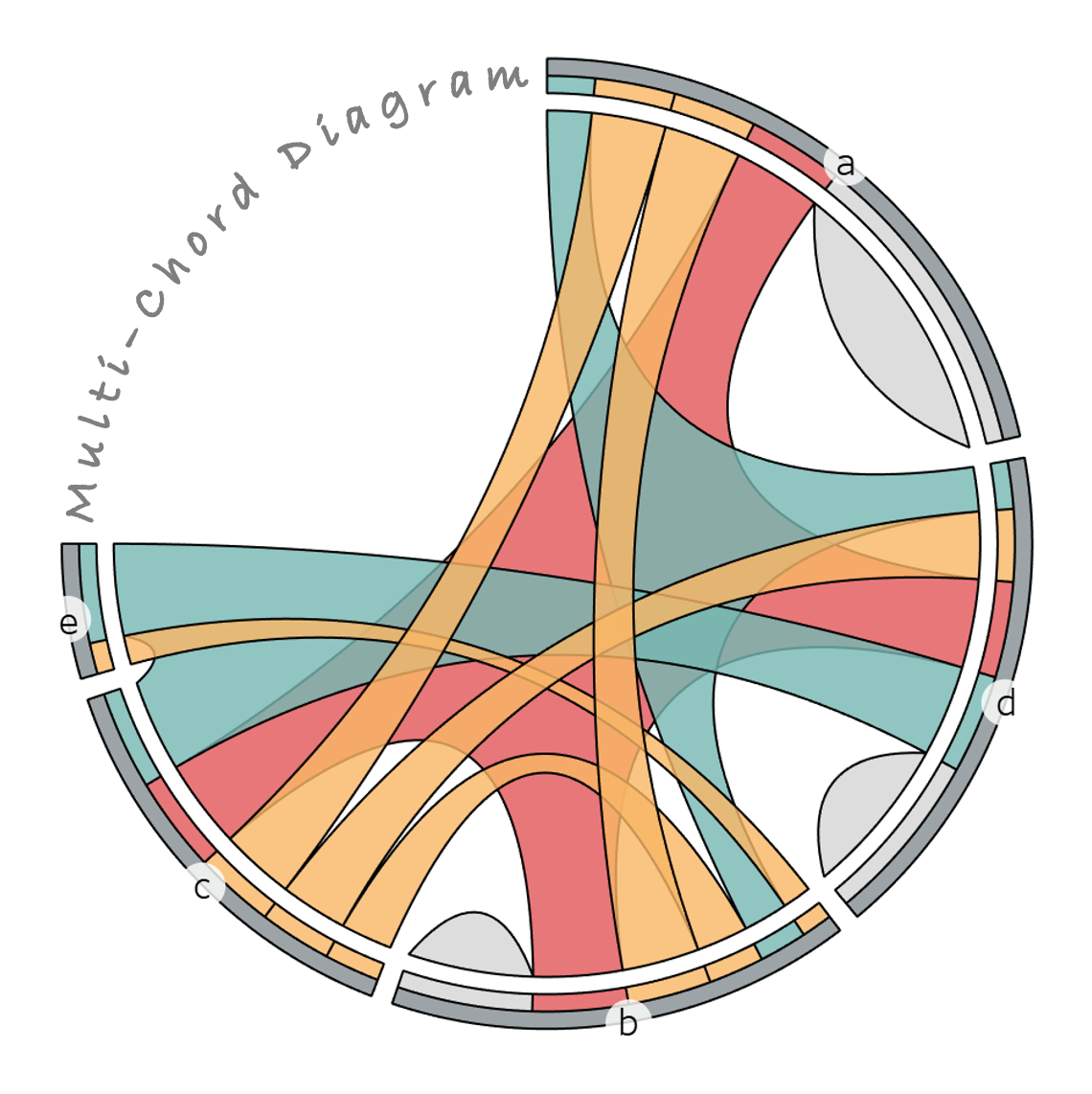
The modern Chord Diagram became particularly notable in recent history following an article published in the New York Times in 2007 citing work by Martin Krzywinski² (a prime contributor to the visualization tool “Circos”³) and, today, is characterized by its circular layout with curved polygon chords connecting sets on the perimeter of a circle, with each chord illustrating the relationship between two sets or a standalone population within one set.
These diagrams are particularly effective in revealing the hidden patterns and connections within a dataset. The strength of the relationships are often represented by the thickness of the chords, and other elements (like color and shapes) can be included to show…

